Getting the most out of raw business data, such as trends and high points, can be a real challenge. That’s where charts, which display data in ways that make it easier for your audience to understand, can come in handy. Although Excel charts are easy to create using the Chart Wizard, there are other, less obvious tools you can use to make your charts even more accessible. We’ll show you five ways to bring your charts to life.
Illustrate Your Chart’s Purpose
Placing a photograph behind the chart itself can illustrate your chart’s theme and set the scene for your data. To do this, first left click on your chart to select either the chart area or the plot area. You can tell which area you have selected by looking in the Names box at the far left of the Excel formula bar.
Right click and choose Format Chart Area or Format Plot Area and from the Patterns tab click the Fill Effects button. Click the Picture tab, Select Picture and locate and select an image to use.
Now click Insert, click OK twice and the photo will appear behind the chart but embedded in it so it moves with it. It’s best to use an image that is approximately the same orientation – landscape or portrait — as the chart itself. If you place the photo on the chart area it will fill the entire area covered by the chart together with its axes and title. If you place it in the Plot Area it will sit behind the grid but not extend beyond it.
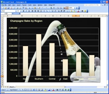 |
| Illustrate the theme of your chart by placing a photograph behind it. |
Replace a Column with Pictures
When your chart is designed to illustrate figures for an audience that is not mathematically inclined, you can make your figures more accessible by replacing the bar or column with a series of small stacked images.
To do this, start in your graphics software and create a series of images with the same dimensions (measured in pixel width and height). If the images are not rectangular, give them a single solid background color and set this color to be transparent before saving the image as a GIF format file. You can use one image multiple times or use different images, one per bar.
In Excel, create a plain 2D column chart and click a column once, pause briefly, and then click it again to select just that column. Right click on that the column and choose Format Data Point.
Now click on Fill Effects, then on the Picture tab, then Select Picture and then select the image you want to use. Click Insert, click the Stack option button and click OK and then OK again. Repeat the process with the other columns. To allow enough room for your images, click once on a column, then right click and choose Format Data Series and Options tab. Use the up-and-down arrow to reduce the Gap Width to somewhere between 50 and 10, and click OK.
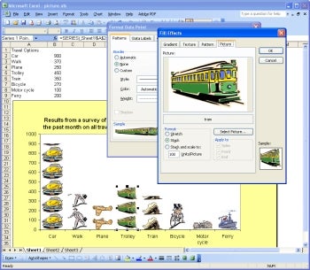 |
| Make it easier for your audience to understand the data by replacing the columns in a chart with graphics that illustrates the series. |
Add a Data Table
When you want to use the visual aspect of a chart and still give your audience access to the data underlying it, use a data table. This displays the data that is shown in the chart in a table underneath it.
To add a data table, select either the Chart Area or the Plot Area, right click and choose Chart Options and then choose the Data Table tab. Now select the Show Data Table checkbox and click OK. You will see your new data table underneath the chart and it will update automatically if the data in the chart is altered.
 |
| Adding a data table lets you provide written data with your visual chart. |
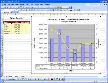
Plot on Two Axes
You may have previously encountered the situation where you try to plot two series, one that contains large numbers and the other with much smaller numbers on the same chart. The resulting chart shows the large values but the plot of the smaller ones is impossible to see simply because the Y-axis values are determined by the largest value in the data you are plotting.
You can salvage your chart and make it meaningful if you plot the smaller values against a separate (second), Y-axis. Prepare your chart in the usual way and click on the series representing the small values – to do this, click on any series and press the right arrow key on your keyboard repeatedly until the series that you cannot see is selected.
On your keyboard, press the Shift key and the F10 key to display the shortcut menu, choose Format Data Series, choose the Axis tab, select the Secondary Axis option and click OK. You should now see the small values charted against the right-most Y-axis. These often look best if plotted using a different chart type. For example, if your chart is a column chart, plot the values on the second axis as a line chart.
To do this, right click the smaller values and choose Chart Type. Now from the Standard Types list choose Line and then choose a Chart Sub-type. Select the Apply to Selection checkbox and click OK.
 |
| When charting two disparate sets of data, consider plotting one set against a second axis. |
Side-By-Side Charts
A chart that shows all the data in one plot is often too cluttered to accurately convey your message. You can avoid this dilemma by displaying the data in side-by-side charts. Because this layout requires the data to be relatively stable, create your charts only after you are sure your data won’t change significantly.
Create a chart for each series of data (to select data that is not contiguous, hold the Control key as you select the headings and then the column of data). Set the maximum Y-axis value for all the charts to the same value by first determining the largest of the Y-axis values. Now, for each chart, right click the Y-axis and choose Format Axis and then Scale tab.
Set the Maximum value to this highest value and then repeat this for all the charts. If the charts also show negative values, set the minimum value for all the Y-axes to the smallest value in the data you’re charting. Arrange the charts side-by-side and size them so the gridlines are all lined up across the page.
On all but the leftmost chart, right click the Y-axis and click Clear to hide the axis – now the values for the Y-axes will be provided by the Y-axis on the left-most chart.
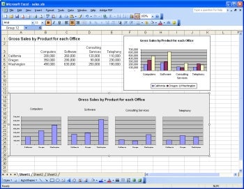 |
| You can draw individual attention to your data by using side-by-side charts that all use the same Y-axis. |
To group the charts, remove the border around each chart by right clicking the chart and choose Format Chart Area, select the Patterns tab, and then set the Border and Area values to None.
Click the Rectangle icon on the Drawing toolbar and drag a large rectangle over all of the charts. Set its Fill and Border to those values that you want to use for the background of the charts. Right-click the rectangle and choose Order and then Send to Back.
Create a text box for the title for all the charts and group all the objects by pressing Shift and clicking on each of the charts, the rectangle and the title. Now right-click and choose Grouping and then Group. Now all the objects will move as one object.
As you can see, you can use a range of different techniques with charts for added visual and information mileage. The next time you present data to an audience, consider whether one of these tips will give your chart additional audience appeal.
| Do you have a comment or question about this article or other small business topics in general? Speak out in the SmallBusinessComputing.com Forums. Join the discussion today! |